American Airlines Vacations: A Journey to a Better Experience ✈️
Overview
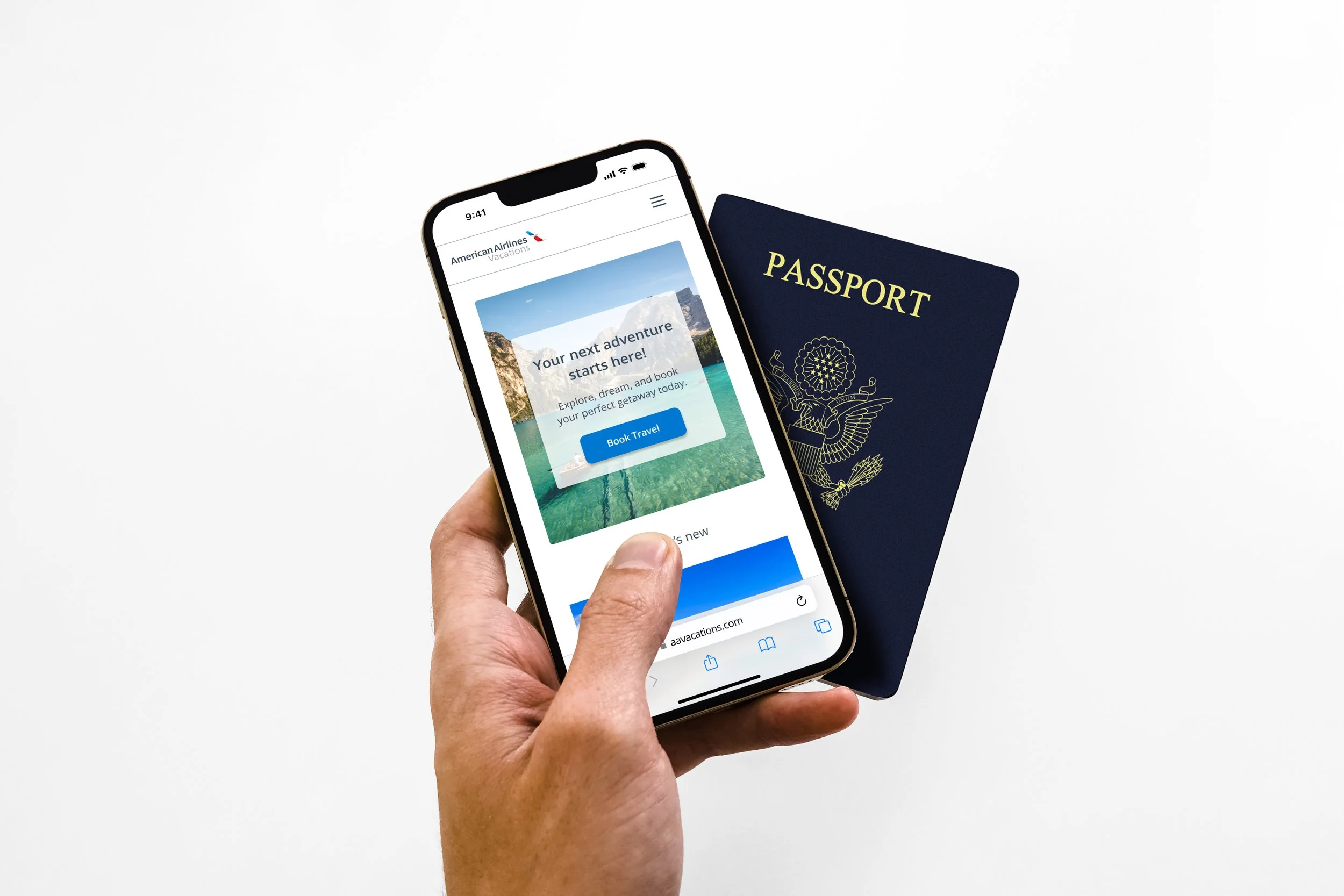
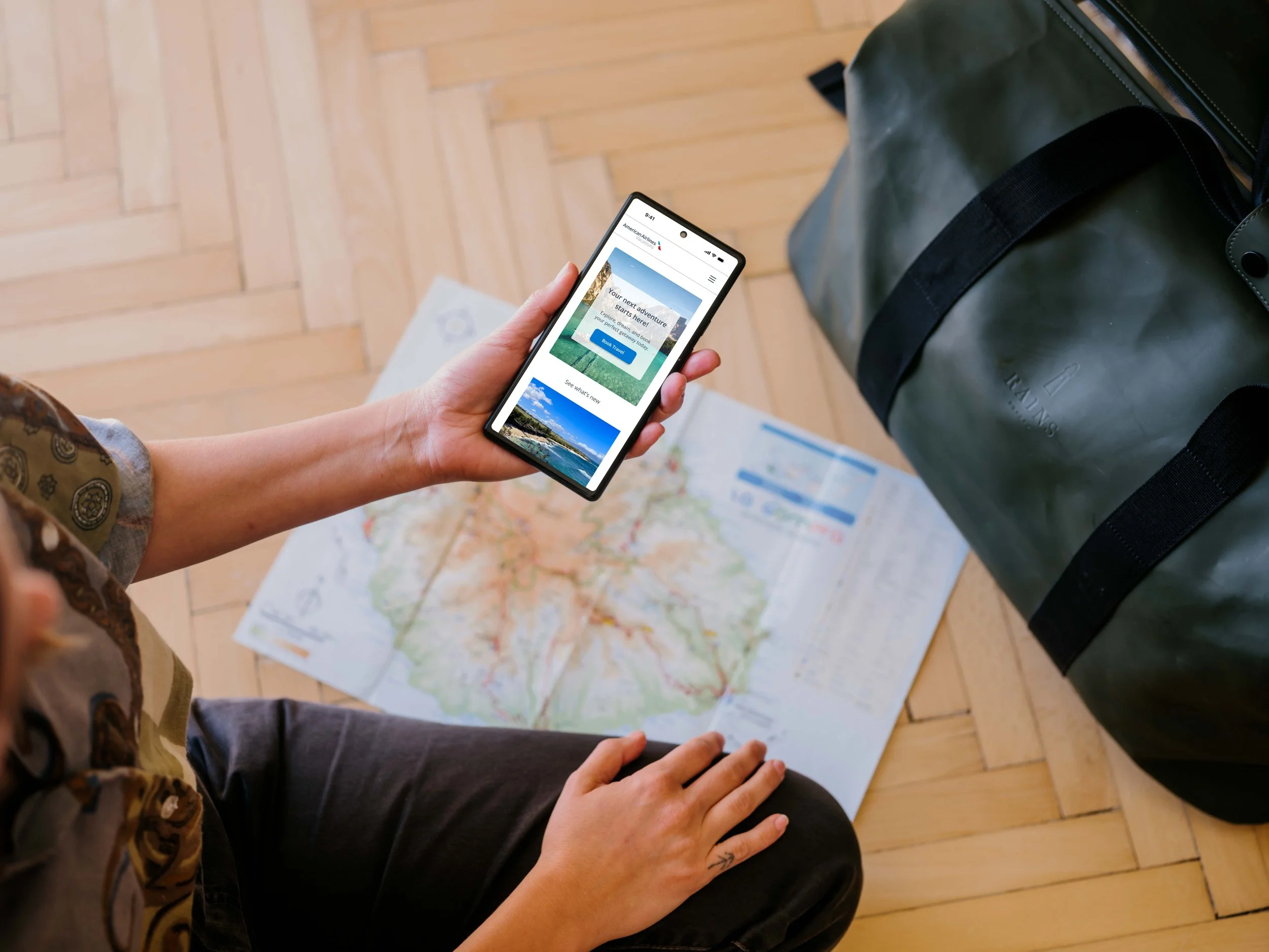
American Airlines Vacations is American Airlines' official vacation booking platform. It offers bundled travel packages that include flights, hotels, rental cars, and experiences. The platform seeks to streamline the vacation planning process by allowing users to book all trip parts in one place, based on their preferences and budget, with added benefits for AAdvantage® loyalty members.


The solution
A Glance at the Solution
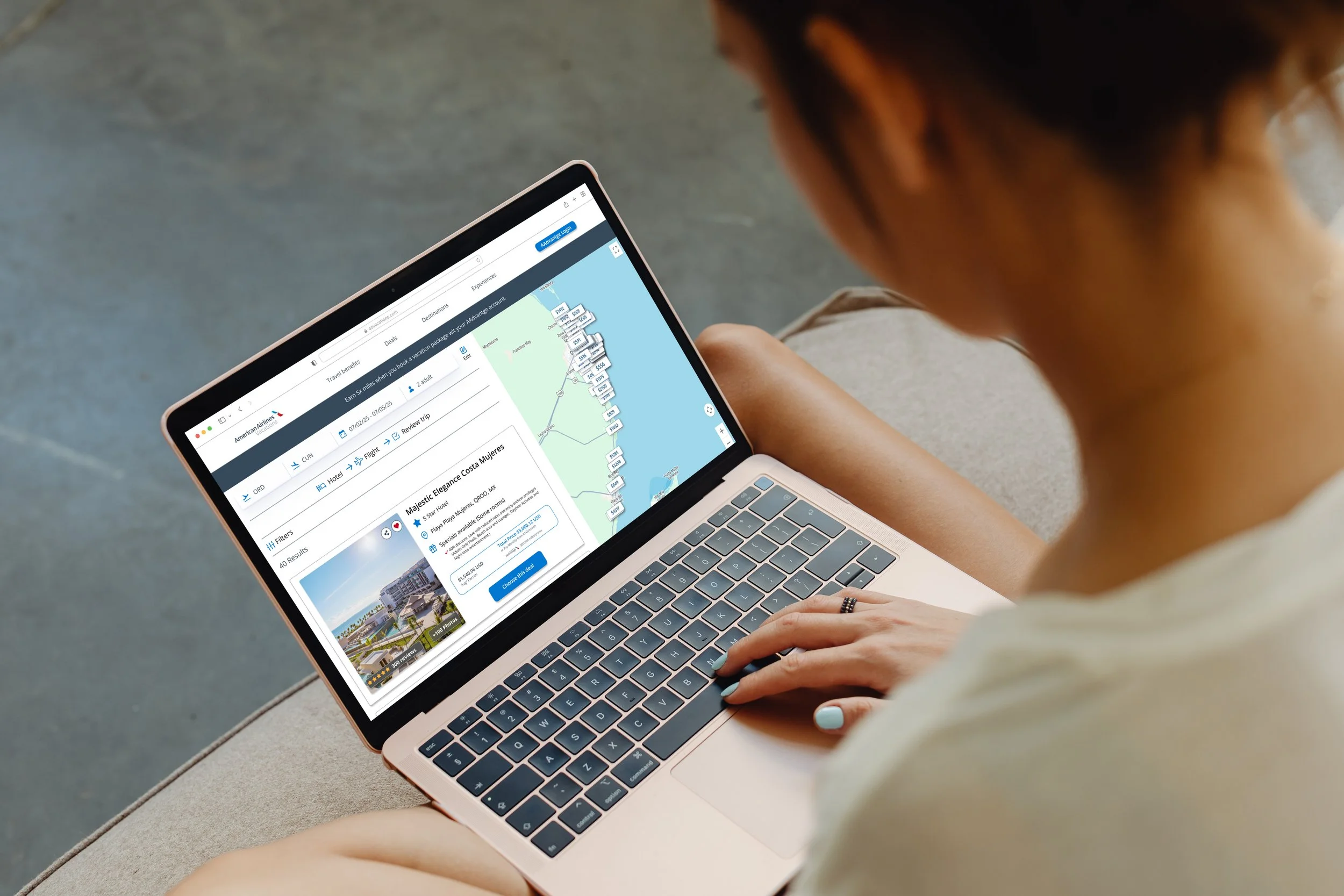
Targeted areas: Enhance the visual hierarchy and improve the filters to help users search based on their intent. Allow users to choose their favorite results for easy comparison and future bookings. Streamline the booking process to simplify navigation by clearly showing the current steps. Display and apply loyalty rewards or discounts during the search to help users maximize their benefits. Additionally, redesign the features for different screen sizes, including desktop and tablet.
The Process

Discover
How it started
As a travel enthusiast and design lover, I genuinely enjoy planning vacations. However, I felt frustrated instead of excited during a recent experience trying to book a trip through their website. This prompted me to analyze my experience, especially because I also explored competitors' websites. I experienced slow navigation, limited search filters, and an uninspiring interface, which made the process feel more like work than wanderlust, so I decided to book with a competitor.
That disappointment sparked an idea when I was searching for a redesign project: What if the experience could match the excitement of planning a dream vacation?.

The problem
Pain Points in the Current Experience
Outdated and confusing interface.
Lacks emotional engagement for vacation planning.
Misses visual inspiration.
Limited filtering options for destinations and packages.
Complex booking process with unclear steps.
Numerous links in the primary navigation that divert from the main page.

Threats
United Vacations and Capital One Travel target the same higher-end travelers and provide similar services. Both offer a superior user experience with modern, highly personalized features and a streamlined booking process, allowing users to bundle flights and hotels in fewer steps easily.

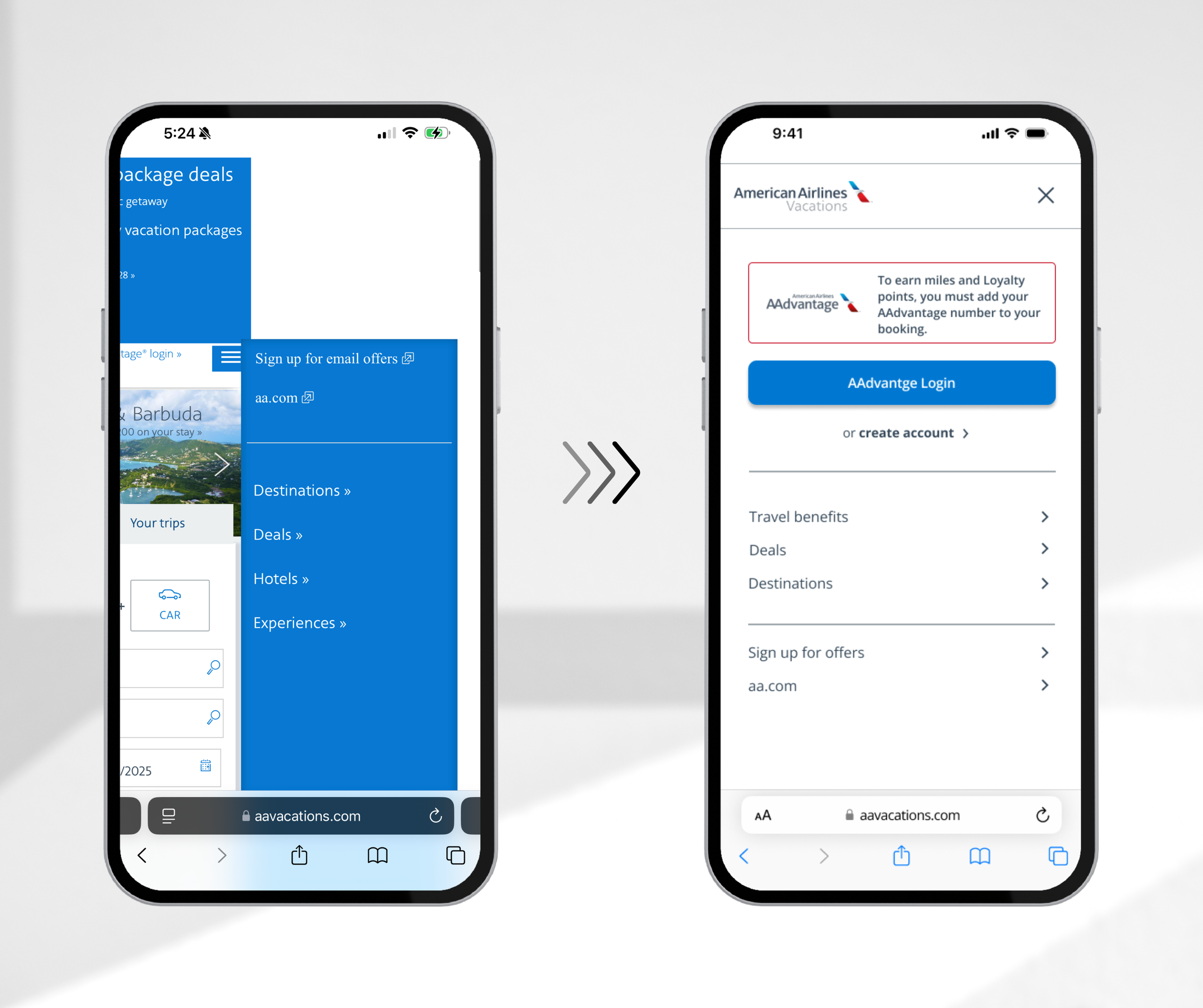
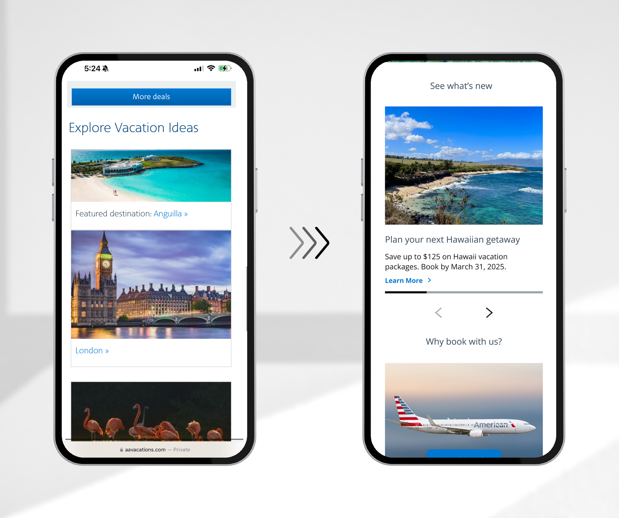
Before & After
-
![]()
Menu
-
![]()
Results
-
![]()
Search
-
![]()
Footer
-
![]()
Filters
-
![]()
Homepage


Define
Who I'm Designing For

Lisa Mitchell
Age: 42
Location: Dallas, TX
Travel Style:
Plans annual family trips using AAdvantage miles.
Use AA Vacations for one-stop booking (flights, hotels, car rentals).
Needs:
Easy, reliable booking experience.
Transparent policies and smooth navigation.
Pain Points:
Frustrated by unclear package options and complex filters.
Values:
“Family-friendly” hotel filter.
Stress-free planning to create lasting memories.

Daniel and Sofia Lewis
Age: 34 and 32
Location: Tampa, FL
Travel Style:
Take short, romantic getaways to recharge.
Prefer bundled deals with value and comfort.
Often browse casually on phones.
Needs:
Personalized inspiration and smart filters (experience, budget, trip length).
Smooth, mobile-first booking experience.
Pain Points:
Frustrated by clunky, uninspiring websites.
Values:
Efficient, flexible platforms that spark excitement and reflect their lifestyle.
User Flows


Ideate
Sketching out the idea
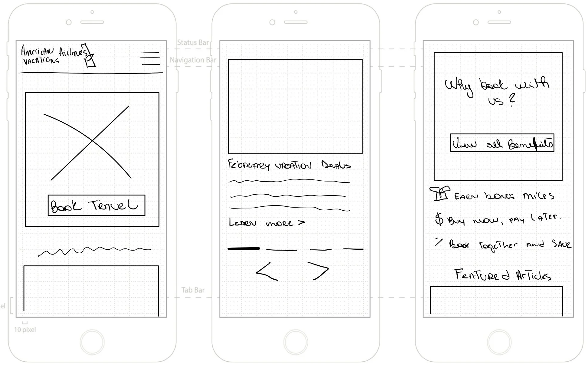
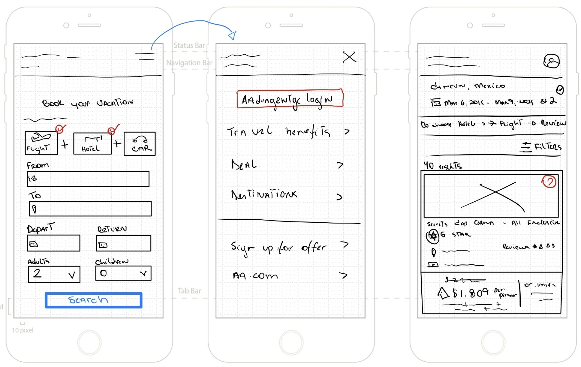
Mid-fidelity Wireframes
I designed mid-fidelity wireframes highlighting layout, content hierarchy, and key functionalities to create structure and clarity in the user journey. These wireframes facilitated early feedback on usability and ensured that the core experience met user needs before progressing to the high-fidelity design phase.

Mood Board
Bringing Vision to Life

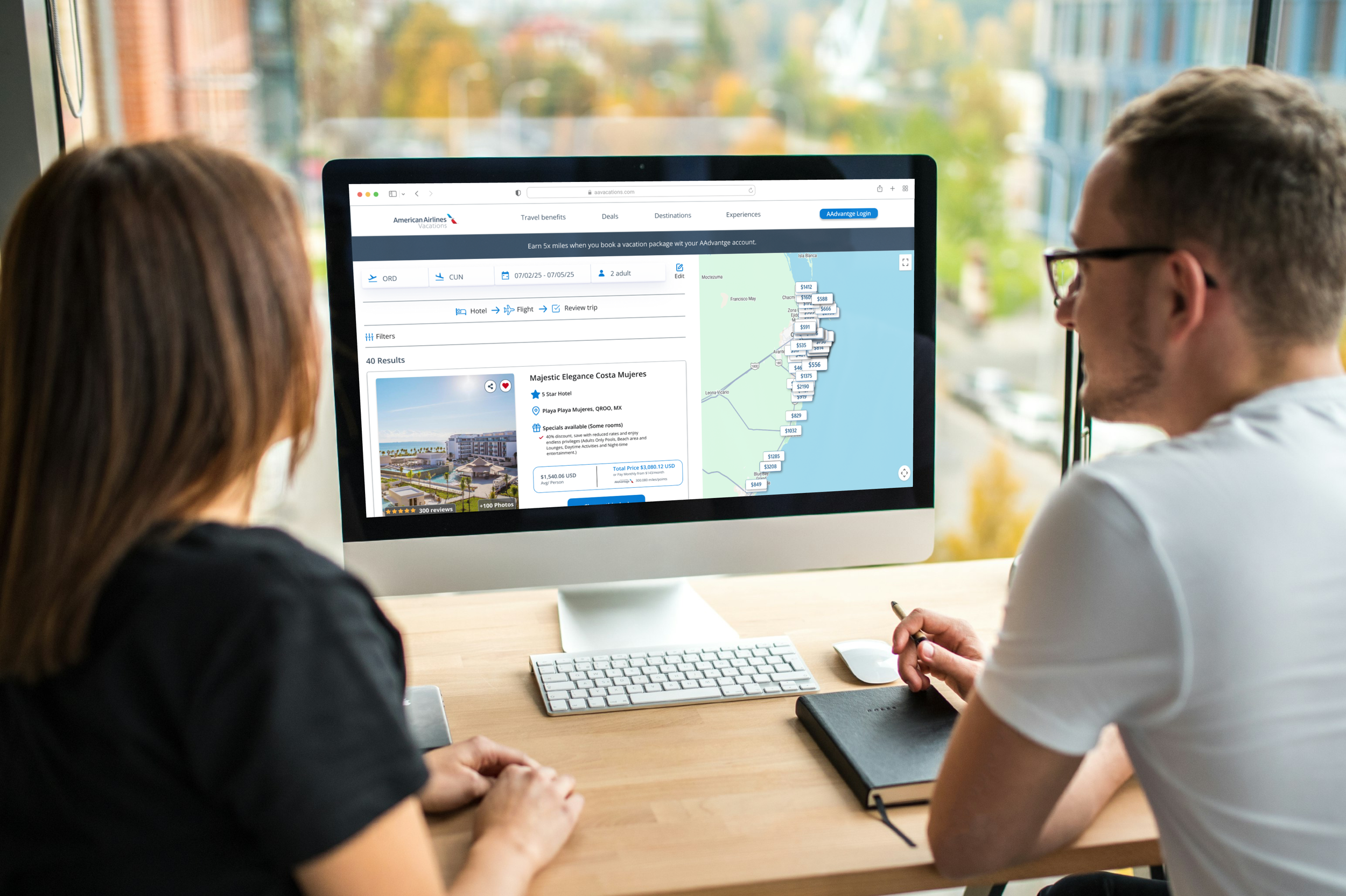
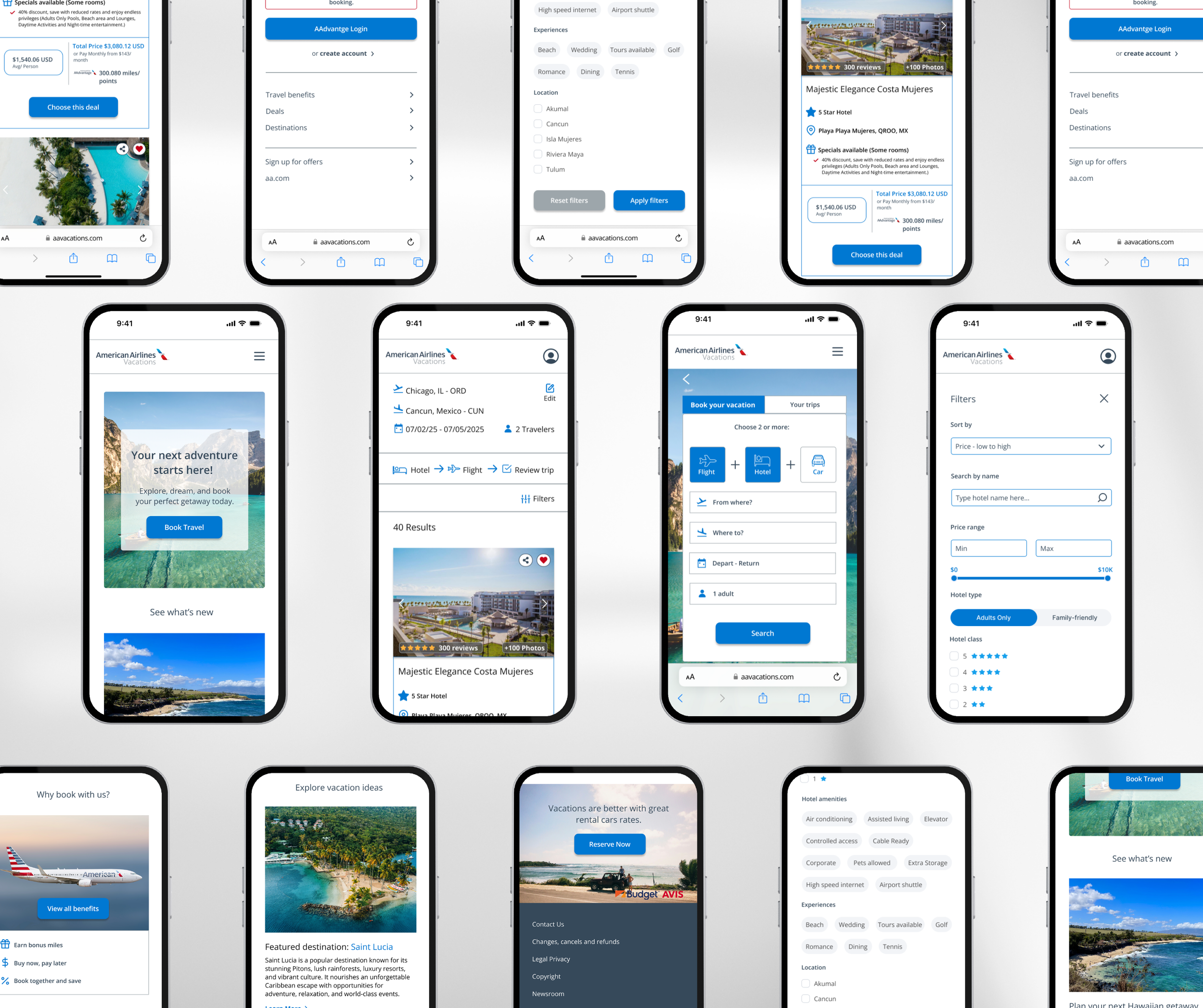
Hi-Fidelity wireframes
From Flow to Form
The high-fidelity wireframes enhance the user experience with a polished visual design that aligns with the American Airlines brand. This design creates a more inviting and intuitive interface for vacation planning. It fosters inspiration and trust through clean layouts, a calming use of brand colors, and purposeful imagery.
Key Improvements:
Simplified navigation
Distinct package comparisons
Clear booking steps
Ability to favorite options
Mobile-optimized interactions
Personalized filters
These enhancements make browsing, envisioning, and confidently booking their trips easier for users.
Prototype
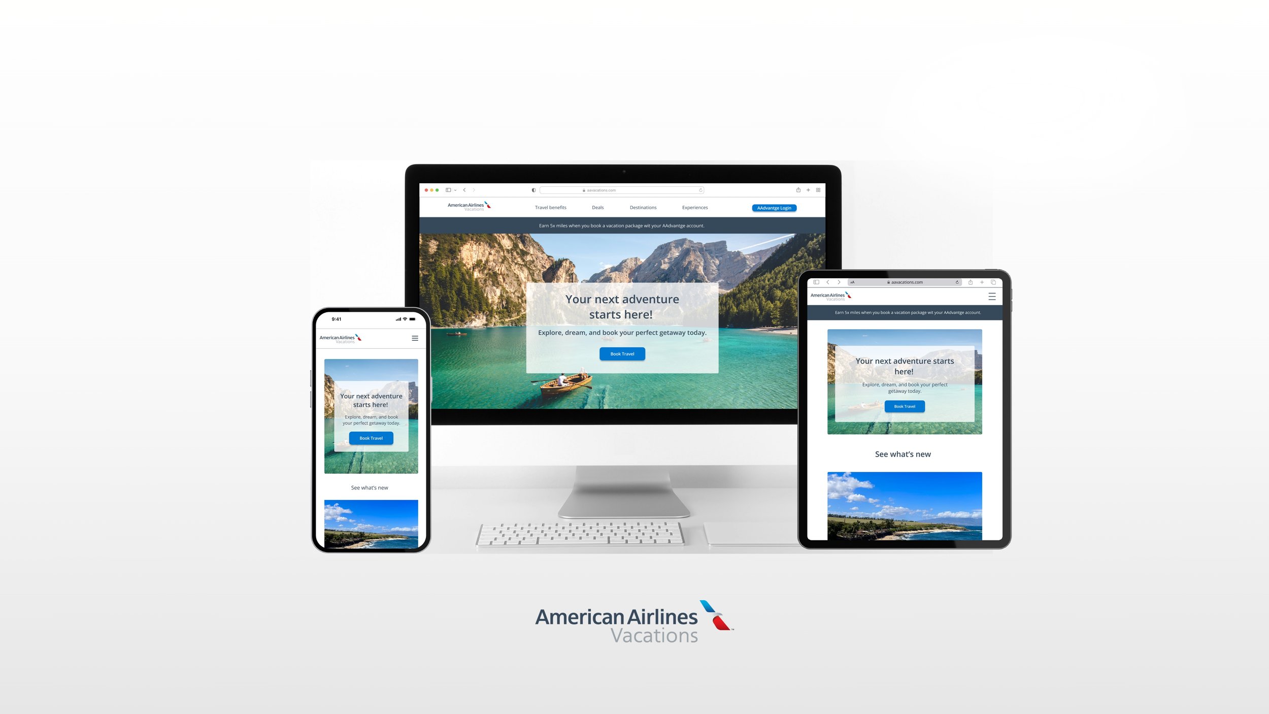
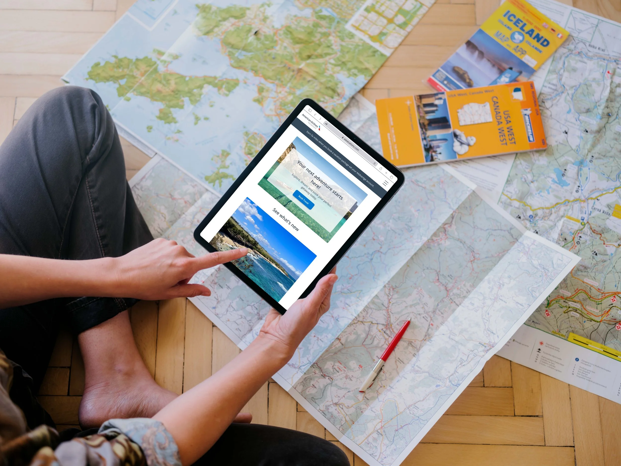
Responsive Design
Desktop & Tablet
What I Learned
The American Airlines Vacations web app redesign was a valuable experience that enhanced my ability to work within an established brand while improving usability and emotional engagement.
I learned to align business goals with user needs by identifying key pain points and transforming them into opportunities for simplicity and inspiration.
I created a more welcoming and intuitive experience using the existing brand palette, demonstrating that design can be elevated without losing brand identity.
This project also developed my skills in responsive design, user research, UI design patterns, and accessibility, emphasizing that great design is functional and human-centered.
Thank you! Get in touch. :)
It all begins with an idea. Whether you're launching something new, exploring a creative path, or simply looking to connect—I'd love to hear from you. Feel free to reach out if you have a project in mind, feedback to share, or want to chat about design. Let's create something meaningful together.